How to Visualize
This blog post will offer some practical advices for visualizing data.
- Learn about your data: Study your data in order to understand it.
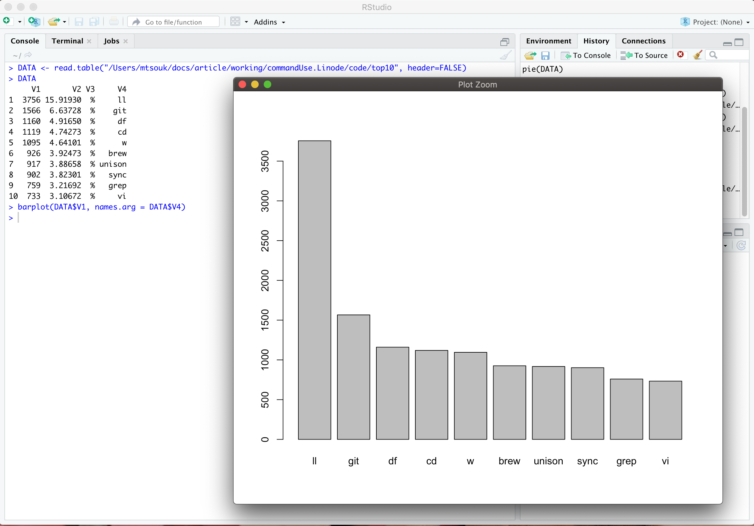
- First, use a simple plot: Your first visualization should be simple in order to understand what is happening.
- Pie charts are not good: Pie charts are difficult to read - avoid them.
- Do not use a 3D plot: Do not use a 3D plot unless you have a really good reason to do so!
- Stacked bar charts are difficult to understand: Do not use a stacked bar chart, unless you have a really good reason to do so!
- Experiment: Experiment as much as possible. Learn about different plots, how to use them and when to use them.
